

Augsburg and Ulm
In the 1470's and 1480's Augsburg and Ulm were the leading centers for the illustrated books North of the Alps. In Augsburg, printers Johann Baemler, Gunther Zainer, Anton Zorg, and Johann Schönsperger were followed by the noted Erhard Ratdolt, whose career spanned more than forty years, beginning with his work in Venice from 1476 to 1486 and continuing in his native Augsburg from 1486 to about 1516. In Ulm, printers such as Johann Zainer, Lienhart Holle, and Conrad Dinckmut supported a number of highly skilled "Formschneider," or block cutters, who worked for the printers and anonymously produced the wood blocks used to illustrate the books. Editions of Boccaccio, Aesop, Ptolemy, and Terrence, flowed from these presses and the images that were created in Ulm define the illustrated book in Northern Europe. Late in the 1480's financial difficulties hit the industry and Ulm lost much of the investment which fueled its printing trade. Zainer and Dinckmut stayed in business, but they were never again able to produce illustrated books of a similar caliber. Many of the woodcutters moved to Augsburg, Basel, or Nuremberg, where the trade in illustrated books was picking up momentum.
The "Simplicity and Cleanliness" of Augsburg Design
Augsburg,1488
Albumasar was a ninth-century Arab astronomer whose systematic analysis of the heavens resulted in a creation theory based on the alignment of the seven known planets. Albumasar's Flores astrologiae, published by the German printer Erhard Ratdolt, is illustrated with seventy-three woodcuts, including twelve small zodiac cuts, seven larger cuts of the planets, and numerous repeats. Ratdolt is remembered as an innovator in the use of decorative initials, woodcut borders, printing in gold, and color printing, with which he experimented during his Venetian period and developed further during the 1490s with Hans Burgkmair. These woodcuts of Apollo and Venus racing across the northern sky are formed of simple lines cut in outline. There is no background or border and very little shading. The result is a clear narrative image created by broad contours with a minimum of embellishment. The images are representative of the German style developed during the late medieval period and demonstrate what scholars David Landau and Peter Parshall characterize in their book The Renaissance Print (1995) as "the simplicity and cleanliness" of Augsburg design.

Albumasar. Flores astrologiae. Augsburg: Erhard Ratdolt, November 18, 1488. Rosenwald Collection. Rare Book and Special Collections Division, Library of Congress (1)
Bookmark this item: //www.loc.gov/exhibits/heavenlycraft/heavenly-15th.html#obj0
Initial Letter Decorated with Branch-and-Leaf Motif Augsburg, 1489
The first and only separately issued fifteenth-century edition of Albumasar's book of conjunctions, a thesis on the creation of the universe, was printed by Erhard Ratdolt in 1489. It was illustrated with 268 woodcuts, most of which appeared in earlier books printed by Ratdolt. Like the images in his Flores astrologiae, the woodcuts of Capricorn (left) and Aquarius (right) are characterized by thick contours or outlines used to define the images and the use of parallel lines to model the forms of the figures. These techniques, common to early German woodcuts of the period, offer the viewer a simple representation of an image—in this case an astrological sign. The clarity of the figures and the creative manner in which they are presented suggest that the designer and the woodcutters were skilled craftsmen. This opening also shows a woodcut initial, an innovation for which Ratdolt is well known. It is cut in the black ground manner and is decorated with branch-and-leaf motif.

Albumasar. Albumasar de magnis coniunctionibus. Augsburg: Erhard Ratdolt, March 31, 1489. Rosenwald Collection. Rare Book and Special Collections Division, Library of Congress (2)
Bookmark this item: //www.loc.gov/exhibits/heavenlycraft/heavenly-15th.html#obj1
Woodcut with Color Wash
Augsburg,1490
This 1490 edition of the Passion of the Lord Jesus Christ is illustrated by a woodcut initial letter and twenty-four hand-colored woodcuts. This woodcut of "Christ Washing the Feet of the Apostles" is one of the more successful in the group. Typical of the early 1480s, the image has broad contours outlining the figures and parallel lines modeling their forms. The spare background and the lack of decoration is typical of German woodcuts of this period. In addition to thick contours and parallel lines, the cutter uses hooked and looped lines to accentuate the garments and to suggest a physical presence beneath the folds. Using color wash to highlight parts of an image was a common practice north of the Alps, particularly to delineate foreground or background or add an ornamental touch that the woodcutter was not able to accomplish with his knife. This volume is the only recorded copy of this edition in America and the only perfect copy extant.
![<em>Passio domini Jesu Christi</em>. Augsburg: [Johann Schönsperger], February 22, 1490. Rosenwald Collection. Rare Book and Special Collections Division, Library of Congress (3)](images/rw146s.jpg)
Passio domini Jesu Christi. Augsburg: [Johann Schönsperger], February 22, 1490. Rosenwald Collection. Rare Book and Special Collections Division, Library of Congress (3)
Bookmark this item: //www.loc.gov/exhibits/heavenlycraft/heavenly-15th.html#obj2
Only Known Complete Copy
Ulm, 1491
This copy of the German language edition of Dye Siben Cursz, a rare devotional book of hours dedicated to the Virgin Mary, is the only known complete copy. It is illustrated with seven original woodcuts, six of which are colored by a contemporary hand. This woodcut illustrates the "Prayers for the Repose of the Souls of the Faithful Departed." The outlines are simple and clear, and the facial expressions and folds of drapery are crisp and precise but uniform and enhanced by only a hint of shading. The delineation of the landscape and sky, along with the hand coloring, add significantly to the appealing effect of the woodcut design. Conrad Dinckmut, the printer of this appealing volume, further enhances the attractiveness of his book by using ornamental capitals in double line to complement both the typographical design of the work and the delicate contours of the figural woodcuts on the opposite page.

Dye Siben Cursz. Ulm: Conrad Dinckmut, 1491. Rosenwald Collection. Rare Book and Special Collections Division, Library of Congress (4)
Bookmark this item: //www.loc.gov/exhibits/heavenlycraft/heavenly-15th.html#obj3
Book with Metal-Cut "Dotted Prints"
Cologne, ca. 1498
Horologium devotionis is a fourteenth-century Latin translation of a popular devotional work about the life and Passion of Christ. The volume is illustrated with eight metal cuts or "dotted prints," so-called because the metal plate upon which the image is cut in relief is decorated with a round metal punch used to create texture and pattern in the image. Like woodcuts, metalcuts were placed in the same form as type, and both text and image were printed at the same time. Most historians of early prints place the origin of the dotted print along the upper Rhine River, with Cologne being one of its centers. This image of "Christ Being Nailed to the Cross" achieves the compositional density and decorative range that was characteristic of metalcuts produced during this period. The central image of Christ stands out against the dotted foreground and backdrop, as do his garment and the figures of his persecutors. Also notable is the decorative border, with its branches, vines, and flowers framing the entire event and focusing attention on the central theme of the cut.
![Bertoldus. <em>Horologium devotionis.</em> Cologne: Johann Landen, [ca. 1498]. Rosenwald Collection. Rare Book and Special Collections Division, Library of Congress (5)](images/rw0005s.jpg)
Bertoldus. Horologium devotionis. Cologne: Johann Landen, [ca. 1498]. Rosenwald Collection. Rare Book and Special Collections Division, Library of Congress (5)
Bookmark this item: //www.loc.gov/exhibits/heavenlycraft/heavenly-15th.html#obj4
Nuremberg
The patronage of Emperor Maximilian I (1459-1519) was critical to making the cities of Augsburg and Nuremberg centers of the German printing trade during the first quarter of the sixteenth century. His commissions for woodcut illustrations were executed by renowned artists from all over Germany, including Albrecht Dürer, Hans Burgkmair, Albrecht Altdorfer, Leonard Beck, Lucas Cranach, and Hans Schäufelein. According to David Landau and Peter Parshall, "his patronage had much to do with the evolution of commercial print production in Germany, and particularly with the rise in importance of professional block cutters, many of whom passed through Maximilian's service at one stage or another" (The Renaissance Print, p. 207).
Woodcut Design Attributed to Albrecht Dürer
Nuremberg, 1500
This edition of the Revelationes (below left) includes eighteen pages of woodcuts loosely based on those in a 1492 Lübeck edition (below right). Nuremberg designers expanded the parameters of illustration by creating more complex compositions, introducing shading and perspective to their images, and emphasizing individual human expression. A comparison between the two editions demonstrates these qualities. In the Nuremberg image, neat rows of almost identical nuns and priests are supplanted by two sets of individually portrayed congregations in motion. The modeling of the folds of the garments and the figures beneath is achieved by a combination of thin and thick parallel lines and cross-hatching. Saint Birgitta in the Nuremberg woodcut has finely rendered eyes, nose, and mouth. This image was cut by a more skilled craftsman, who invests the image with meaning and also beauty. Recent research suggests the design is by Albrecht Dürer.
1 of 2
-
Saint Birgitta. Revelationes. Nuremberg: Anton Koberger, September 21, 1500. Rosenwald Collection. Rare Book and Special Collections Division, Library of Congress (6)
-
 Enlarge
Saint Birgitta. Revelationes. Lubeck:1492. Catalogue of a Collection of Early German Books in the Library of C. Fairfax Murray, vol. 1. Comp. Hugh William Davies. London: 1913. Rare Book and Special Collections Division, Library of Congress (6A)

Bookmark this item: //www.loc.gov/exhibits/heavenlycraft/heavenly-15th.html#obj5
Sources for the Imagery of Ars moriendi
Leipzig, after 1500
Germany, ca. 1465
Ars moriendi is a genre of prayer book that records the medieval church's rituals surrounding death. Two editions are displayed for comparison: the Melchior Lotter edition printed around 1500 (left) and the probable source of this image, a German book printed in about 1465 (right). The image represents the "temptation of impatience," in which the dying man kicks his physician while his wife pleads for patience, and a devil expresses pleasure at the success of his intervention. The complex spatial composition of both images is almost identical, except that the woodcut used by Lotter is in reverse, as is typical when a design is copied from an existing image and a new block cut. In both images, the border pattern is the same, the use of parallel lines to create shading is consistent, and the facial expressions are similar for all four characters. The only significant differences are the greater use of parallel lines in the later cut and a more complex floor pattern.
1 of 2
-
Ars moriendi. Leipzig: Melchior Lotter, after 1500. Rosenwald Collection. Rare Book and Special Collections Division, Library of Congress (7)
-
Ars moriendi. [Germany: ca. 1465]. Rosenwald Collection. Rare Book and Special Collections Division, Library of Congress (7A)

![<em>Ars moriendi.</em> [Germany: ca. 1465]. Rosenwald Collection. Rare Book and Special Collections Division, Library of Congress (7A)](images/rw20s.jpg)
Bookmark this item: //www.loc.gov/exhibits/heavenlycraft/heavenly-15th.html#obj6
Rare Prayer Book Illustrating Life and Passion of Christ
Magdeburg, 1500
Moritz Brandis, a provincial printer working in Magdeburg on the Elbe River, was noted for publishing religious texts, missals, prayer books, and local council documents. This rare survival of his Meditationes de vita et passione Jesu Christi, known in only two copies, is illustrated with sixty-seven woodcuts, created in simple contours in outline with parallel lines added for background. The image of the "Guards Gambling for Christ's Garments" effectively captures the action of the scene and depicts Christ's persecutors as consumed with greed and oblivious to the significance of the events taking place around them. The rolling dice, the drawn weapons, the torn knee in the pants of the man in the foreground, and the determined expression of each of the men, reveal to the viewer the chaos surrounding the Passion and the horror of the Crucifixion.
![Jordan van Quedlinburg. <em>Meditationes de vita et passione Jesu Christi.</em> [Magdeburg: Moritz Brandis, 1500]. Rosenwald Collection. Rare Book and Special Collections Division, Library of Congress (8)](images/rw209s.jpg)
Jordan van Quedlinburg. Meditationes de vita et passione Jesu Christi. [Magdeburg: Moritz Brandis, 1500]. Rosenwald Collection. Rare Book and Special Collections Division, Library of Congress (8)
Bookmark this item: //www.loc.gov/exhibits/heavenlycraft/heavenly-15th.html#obj7
Rome
Unlike Venice and Florence in the last two decades of the fifteenth century, Rome never became a center for the printing of illustrated books. The three most important Roman printers of the period, John Besicken, Andreas Freitag, and Stephen Plannck were German by birth and training, and their publications reflected a Germany style in book production. Also, Roman print culture did not evolve from a fine arts tradition as occurred in Venice and Florence. No leading school of painting contributed its influence to the woodcutters and designers at work in Rome, and as a result, the woodcut there did not take on the fresh characteristics of the Renaissance style until after the turn of the sixteenth century.
First Italian Book Illustrated with Woodcut Series
Rome, 1484
Cardinal Juan de Torquemada's Meditations on the life of Christ, a cornerstone of Italian book illustration, is thought to be the first Italian book illustrated with a series of woodcut images. The first edition was printed in Rome in 1467 by the German printer Ulrich Han. The copy displayed here is the fourth edition, printed Stephan Plannck, Han's apprentice who took over the business after his death. The designs of the thirty-three woodcuts, though considered rough by some early critics, are distinguished by their spaciousness, clarity, and economy of line, all important characteristics of the Italian woodcut before 1490. These woodcuts of "Adam and Eve in the Garden" and "The Annunciation" are simply constructed, gracefully executed, and eminently accessible to the viewer. A sensuousness in the lines that define Adam's torso and the fine turn of Eve's ankle suggests a developed sense of artistic possibility. This emphasis on the physical form demonstrates a new artistic awareness that was developing in Italian woodcut design during the early Renaissance.

Juan de Torquemada. Meditationes. Rome: Stephan Plannck, March 13, 1484. Rosenwald Collection. Rare Book and Special Collections Division, Library of Congress (9)
Bookmark this item: //www.loc.gov/exhibits/heavenlycraft/heavenly-15th.html#obj8
Important Edition of Divine Comedy
Venice, 1491
This 1491 edition of Dante Alighieri's Divine Comedy is considered by many bibliographers to be one of the most important illustrated editions of Dante's masterpiece printed in the fifteenth century. It contains three full-page woodcuts introducing each of the books of Dante's poem and ninety-seven small cuts illustrating the action of each canto. Framed by a monumental architectural border, this large woodcut illustrating the beginning of Book 3, Il Paradiso, translates into pictorial form Dante's beloved Beatrice's vision, transmigration, and ecstacy as she ascends from earth to paradise. The image exemplifies the "popular" style of Venetian woodcut, which gets its name from the designer's decision to dress its characters in contemporary costume, to use playful images to decorate borders, and to populate the composition with animals, birds, and flowers. The designer achieves this effect by the delicate use of outline to construct forms rather than relying on shading or parallel lines. This technique keeps the image open, less formal, and emphasizes the popular nature of the design.

Dante Alighieri. La Commedia. Venice: Bernardinus Benalius and Matteo Capcasa, March 3, 1491. Rosenwald Collection. Rare Book and Special Collections Division, Library of Congress (10)
Bookmark this item: //www.loc.gov/exhibits/heavenlycraft/heavenly-15th.html#obj9
Cleverly Designed Woodcuts Created as Educational Aids
Florence, 1491-92
Calandri's Arithmetica is the first Italian arithmetic book to contain illustrations that illuminate mathematical problems, as well as being the first work to discuss long division. The woodcuts contain many of the characteristics of Florentine designs from this period, including the use of ornamental borders to frame an image, simple contours to elucidate content, and sensitive physical representations that depict human expression. In this illustration, the borders of the woodcut are characterized by a freedom of line and playful imagery. Composed of four individual blocks all of different design, the borders are cut in a delicate yet casual style, incorporating standard motifs of columns, urns, foliage, branch-and-leaf patterns, cherubs, and birds. The hands counting numbers are cleverly designed and sensitively convey motion. They depict a physical reality typical of woodcuts produced in early Renaissance Florence. The remainder of the woodcuts in this volume illustrate mathematical problems, including examples of use to builders, merchants, and farmers.

Filippo Calandri. Arithmetica. Florence: Lorenzo Morgiani and Johannes Petri, January 1, 1491-92. Rosenwald Collection. Rare Book and Special Collections Division, Library of Congress (11)
Bookmark this item: //www.loc.gov/exhibits/heavenlycraft/heavenly-15th.html#obj10
Master with Students
Florence, 1492
The subject of this woodcut, "The Master and His Seven Students," was a common motif used in Italy to illustrate educational or scientific books, much the way portraits of saints were used for religious tracts. This image introducing Landino's manual for secretarial writing is considered one of the finest woodcuts produced in fifteenth-century Florence. The artist's consummate skill at drawing and composition are perfectly matched by a woodcutter capable of creating fine line cuts that translate expression and motion in a natural and convincing manner. The ordinary nature of this composition is heightened by the emphasis on the individual characteristics of each of the figures. The thin ribbon-patterned border is a common element of Florentine woodcuts. In A Catalogue of the Books in the Library of C. W. Dyson Perrins (1914), Alfred Pollard called this woodcut a "little masterpiece of quiet drama."

Christoforo Landino. Formulario di lettere et di orationi volgari. Florence: Antonio di Bartolommeo Miscomini, 1492. Page 2. Rosenwald Collection. Rare Book and Special Collections Division, Library of Congress (12)
Bookmark this item: //www.loc.gov/exhibits/heavenlycraft/heavenly-15th.html#obj11
Treatise on the Use of the Astrolabe
Rome, ca. 1492-93
The frontispiece of Bonet de Latis's elementary treatise on the use of the astrolabe is based on a Neapolitan model first used in 1485. This illustration is a good example of how often woodcut designs were copied, and how various styles were mixed and matched by printers who did not have access to skilled cutters and designers. The central image is defined by simple contour lines delineating figures and repetitive parallel lines modeling both the sunburst and the ornamentation on the architectural structure. The two sets of borders are both in the Florentine style common after 1490. The inner one is a common dart-patterned border cut directly on the woodblock. The outer, more elaborate border is constructed of four pieces placed around the woodcut of the scholar and his patron. This border is decorated with a hound-and-hare motif, jousting cherubs riding boars, and candelabra designs decorating the sides. These borders can be found on numerous Florentine woodcuts printed in the last decade of the fifteenth century.
![Bonet de Latis. <em>Annulus astronomicus.</em> [Rome: Andreas Freitag, ca. 1492-93]. Rosenwald Collection. Rare Book and Special Collections Division, Library of Congress (13)](images/rw272s.jpg)
Bonet de Latis. Annulus astronomicus. [Rome: Andreas Freitag, ca. 1492-93]. Rosenwald Collection. Rare Book and Special Collections Division, Library of Congress (13)
Bookmark this item: //www.loc.gov/exhibits/heavenlycraft/heavenly-15th.html#obj12
Example of the Florentine "Large-Style" Woodcut
Florence, 1493
This rare, anonymous collection of sermons originally attributed to Saint Augustine was at the time Rosenwald purchased it the only copy in an American collection. Like the woodcut of the "Master with his Seven Students" (no. 12) this portrait of the saint in his study illustrates the essential elements of Florentine style during the 1490s. The distinctive decorative black-ground border, the finely cut contours of the figure and his study, and the simple composition rendering the author at work create an intimate scene appropriate to the text of the sermons. Augustine's halo, his monk's tonsure, and the bishop's miter resting on the edge of the desk each signify a stage of his life and signal his eventual canonization. This image is considered one of the finest Florentine woodcuts of the "large style" printed in the fifteenth century and has been as highly praised as the "Master and His Seven Students."
![[Saint Augustine]. <em>Sermones ad heremitas</em>. Florence: Antonio di Bartolemmeo Miscomini, June 28, 1493. Rosenwald Collection Rare Book and Special Collections Division, Library of Congress (14)](images/rw277s.jpg)
[Saint Augustine]. Sermones ad heremitas. Florence: Antonio di Bartolemmeo Miscomini, June 28, 1493. Rosenwald Collection Rare Book and Special Collections Division, Library of Congress (14)
Bookmark this item: //www.loc.gov/exhibits/heavenlycraft/heavenly-15th.html#obj13
Only Recorded Copy of Edition
Brescia, ca.1487
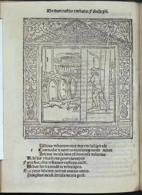
This is the only recorded copy of this undated edition of Aesop's Fables printed in Brescia about 1487. It includes forty-three of the sixty-seven cuts that appear in another edition, dated March 7, 1487, issued by the same printer. The image illustrates the tale of the "Country Mouse and the City Mouse," a well-known fable that extols the joys of the pastoral life and warns of the risks of urban living. What is most striking about this woodcut is the scale of the characters and the open environment in which they are placed. The setting is well defined, uncluttered, and spacious. The steward, in contemporary costume, is simply drawn but effectively portrayed, and the mice, aware of the intruder, seem to be in motion. All is accomplished with the sparse use of black line and no shading. The image is enclosed by a thin fish-scale border style that was adopted by many Florentine printers in the 1490s.
![Aesop. <em>Aesopus moralisatus</em>. [Brescia, Boninus de Boninus, ca. 1487]. Rosenwald Collection. Rare Book and Special Collections Division, Library of Congress (15)](images/rw0015s.jpg)
Aesop. Aesopus moralisatus. [Brescia, Boninus de Boninus, ca. 1487]. Rosenwald Collection. Rare Book and Special Collections Division, Library of Congress (15)
Bookmark this item: //www.loc.gov/exhibits/heavenlycraft/heavenly-15th.html#obj14
Elements of the Venetian Style
Venice, 1493
Illustrated with sixty-seven woodcuts, this edition of Aesop's Fables exemplifies the various influences that characterize the Venetian woodcut during the final decade of the fifteenth century. The architectural border framing the image of the "Country Mouse and the City Mouse" is a common element of Venetian woodcuts. In this case it is adopted from a border design first used by Francesco Tuppo in his 1484 edition of Aesop printed in Naples. The composition of the central image, clearly cut in fine outline, is based on the 1487 edition (no. 15). Given the prominence of Venice as the center of printing and publishing in Italy during the last decades of the fifteenth century, it is not surprising that the artistic design of the Venetian illustrated book was influenced by books from towns such as Naples, Verona, and Brescia. The four-piece border, the architectural headpiece, and the sparsely drawn lines are all design elements that first appeared elsewhere in Italy but were very quickly adopted and became part of the developing Venetian style.
Aesop. Aesopus moralisatus. Venice: Manfred de Bonellis, August 17, 1493. Rosenwald Collection. Rare Book and Special Collections Division, Library of Congress (16)
Bookmark this item: //www.loc.gov/exhibits/heavenlycraft/heavenly-15th.html#obj15
Giunta Edition of the Malermi Bible
Venice, 1494
Printed in Venice in 1494, this is the third edition of LucAntonio Giunta's Biblia italica. Called the Malermi Bible after its translator, the first edition appeared in 1490 and was illustrated with 384 woodcuts. It was previously printed in 1492 and in 1494, and both editions were illustrated with 430 woodcuts. This edition's opening of the Biblical book of Genesis illustrates the "popular" style of the Venetian woodcut at its most impressive. The two pages are framed by a four-piece monumental architectural border cut in outline and decorated in an open and playful style. On the left, the border encloses a series of woodcuts in outline representing the six days of creation, and on the right, the border encloses two columns of text and a large initial letter "N"also cut in fine line. Characteristic of the Bible is the thoughtful integration of text and image. In addition to the large initial letter "N," the book is filled with floriated and historiated initial letters and carefully cut black-ground woodcuts of saints and prophets that are placed throughout the text and greatly contribute to the typographical harmony of the volume.
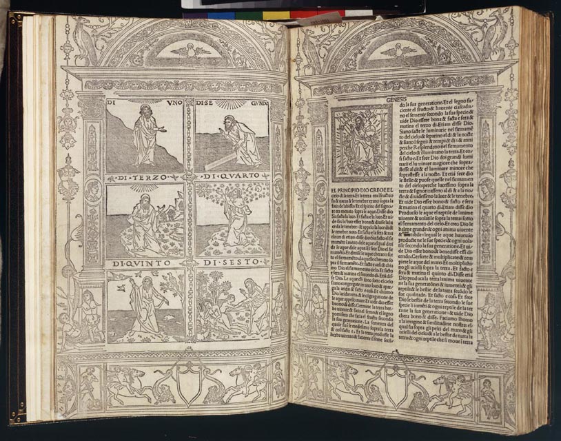
Biblia italica. Translated from the Latin by Niccolò Malermi. Venice: Johannes Rubeus Vercellensis for LucAntonio Giunta, June 1494. Rosenwald Collection. Rare Book and Special Collections Division, Library of Congress (17)
Bookmark this item: //www.loc.gov/exhibits/heavenlycraft/heavenly-15th.html#obj16
Most Notable Rosenwald Purchase of Sale
Florence, 1495
Piero Pacini's edition of the Epistles of the Evangelists is considered the greatest Florentine illustrated book of the fifteenth century. It is the most notable book that Mr. Rosenwald purchased at the Dyson Perrins sale. The book contains 144 large woodcuts, all but 8 original to this text, 24 small cuts of saints and prophets, and a series of 14 different border styles. The large number of images, along with the quality of the designs and cutting, makes this work a treasure house of Florentine design and one of the truly important sources for the study of the Renaissance woodcut. This title leaf is one of the most striking of the period and reflects the influence of Florentine painting on woodcut composition. This influence is also visible in the 144 large woodcuts where the styles of the artists Donatello, Alessandro Botticelli, and Domenico Ghirlandaio can be identified. In addition to compositional format, the woodcuts exhibit convincing representations of the human form in motion and nearly always succeed in focusing the attention of the viewer on the dramatic action of the Gospel story. This volume is one of two known copies of the book.

Epistolae et Evangelii et lectioni vulgari in lingua toscana. Florence: Lorenzo Morgiani and Johannes Petri, for Piero Pacini, July 27, 1495. Page 2. Rosenwald Collection. Rare Book and Special Collections Division, Library of Congress (18)
Bookmark this item: //www.loc.gov/exhibits/heavenlycraft/heavenly-15th.html#obj17
Only Copy in America
Florence, ca. 1495
This image of the "Master and His Disciple" is designed in typical Florentine style, framed by a black-ground, dart-patterned border. The two figures caught in debate are dressed in finely contoured costumes cut with considerable care, and each figure is rendered with distinctive facial features. The woodcut's architectural element, with its complex brick pattern and shading, defines the space and provides perspective. The free-spirited manner in which the lines of the floor are cut suggests a confident craftsman skilled at evoking fine details with the flick of his knife. Other than a woodcut initial letter, this illustration is the only one used by Libri in the printing of this tract. The ownership mark of the shield within a wreath that is stamped below the woodcut is yet to be identified. One of four known copies, this printing of a rhetorical exercise by Francesco Berlinghieri is the only example in an American library.
![Francesco Berlinghieri. <em>Protesto alla signora di Firenze</em>. [Florence: Bartolommeo Libri, ca. 1495]. Rosenwald Collection. Rare Book and Special Collections Division, Library of Congress (19)](images/rw308s.jpg)
Francesco Berlinghieri. Protesto alla signora di Firenze. [Florence: Bartolommeo Libri, ca. 1495]. Rosenwald Collection. Rare Book and Special Collections Division, Library of Congress (19)
Bookmark this item: //www.loc.gov/exhibits/heavenlycraft/heavenly-15th.html#obj18
A Medieval-Style Woodcut
Rome, after 1495
The woodcut on the title page of this rare sermon printed by Johann Besicken and Sigismundus Mayer in Rome around the end of 1495 illustrates the stoning of Saint Stephen, the first Christian martyr. This image clearly demonstrates the differences in style between Roman woodcuts influenced by German traditions and those designed and printed in Venice and Florence. In this woodcut, the figures are cut in thick contours on a single plane and parallel lines are used for shading. The image of the young man carrying a basket of stones lacks the fluidity of motion or the natural grace of its Florentine counterpart. The landscape is only suggested by varied parallel lines and blank space. Unlike Venetian and Florentine cuts printed before 1500, the image has no ornamentation or decorative border to enhance its artistic quality. This medieval style produces a much different effect than the compositional arrangements and skilled craftsmanship of Venetian and Florentine woodcuts.
![Raynaldus Monsaureus. <em>Sermo de visione Dei.</em> [Rome: Johann Besicken et Sigismundus Mayer, after December 26, 1495]. Rosenwald Collection. Rare Book and Special Collections Division, Library of Congress (20)](images/rw310s.jpg)
Raynaldus Monsaureus. Sermo de visione Dei. [Rome: Johann Besicken et Sigismundus Mayer, after December 26, 1495]. Rosenwald Collection. Rare Book and Special Collections Division, Library of Congress (20)
Bookmark this item: //www.loc.gov/exhibits/heavenlycraft/heavenly-15th.html#obj19
Famous Woodcut Binding Designed in Ferrara
Milan, 1496
Produced in Ferrara during the last years of the fifteenth century, this famous woodcut was designed specifically as a binding. It was printed and then pasted to the boards that protected the volume. It has no relationship to the text, printed in Milan. The border designs and patterned ornaments of this woodcut binding are produced in the black-ground manner in Florentine style, probably in the shop of the noted printer Lorenzo di Rossi, who worked in Ferrara for forty years. The image of "Saint George and the Dragon" is likely based on a painting by the Ferrarese master Cosimo Tura. The outline design of the figures, flowers, urns, and cherubs suggests the influence of the "popular" design of Venetian woodcuts. The image is a powerful example of the various influences that contributed to the evolving style of the Italian woodcut in the late fifteenth century. This copy is one of only two known and is the only copy in an American collection.

Battista Fregoso. Anteros, sive Tractatus contra amorem. Milan: Leonardus Pachel, 1496. Page 2. Rosenwald Collection. Rare Book and Special Collections Division, Library of Congress (21)
Bookmark this item: //www.loc.gov/exhibits/heavenlycraft/heavenly-15th.html#obj20
Rare Florentine Edition Illustrated with Venetian Woodcuts
Florence,1496
This edition of the Accounts of the Evangelists was based on Piero Pacini's edition of the Epistles of the Evangelists printed fourteen months earlier (no. 18). The first leaf of the text is illustrated with a half-page woodcut of the "Last Judgment," cut in outline and enclosed by a full-page, black-line architectural border in the "popular" style of the Venetian woodcut. This well-known design was first employed by Venetian printers in 1492 before Bartolommeo di Libri used it in this Florentine edition of 1496. It lacks the sophistication of Pacini's designs, in which the borders were more carefully defined, and the figures were rendered with more individual characteristics and natural body movements. However, the design is an excellent example of the fluid nature of the printing trade in Italy and the movement of woodblocks and woodcut designs from printer to printer. It also demonstrates how local styles, once circulated, were absorbed by designers in other printing markets. This volume is the only copy of the book in the United States and one of only several known surviving copies.
![[Simon de Cassia]. <em>Esposizione sopra evangeli.</em> Ed. Giovanni da Salerno. Florence: Bartolommeo di Libri, September 24, 1496. Page 1. Rosenwald Collection. Rare Book and Special Collections Division, Library of Congress (22)](images/rw316_1s.jpg)
[Simon de Cassia]. Esposizione sopra evangeli. Ed. Giovanni da Salerno. Florence: Bartolommeo di Libri, September 24, 1496. Page 2. Rosenwald Collection. Rare Book and Special Collections Division, Library of Congress (22)
Bookmark this item: //www.loc.gov/exhibits/heavenlycraft/heavenly-15th.html#obj21
Composition Based on Contemporary Paintings
Venice, 1497
The "Agony in the Garden" is one of the most complex of the eleven woodcuts that illustrate this text devoted to the Passion of Christ. The spacious arrangement of the image created on such a small scale reflects the compositional influence of religious paintings of the period. The fully developed landscape comfortably encompasses the five figures, with Christ as the focal point. The simple outlines are delicately cut and clearly convey the story of Christ receiving the cup of the passion while the Apostles sleep. At least three different hands were involved in the cutting of the eleven images for this text. The mixed quality of the images may be related to the nature of the publishing enterprise operated by Lazarus de Soardis, who was known to have worked with many other Venetian printers. It is likely that some of the cuts used in this book came from de Soardis's associates and were originally designed for other publications.
![[St. Bonaventura?]. <em>Meditatione de la passione de Christo. </em>Venice: Lazarus de Soardis, March 16, 1497. Rosenwald Collection. Rare Book and Special Collections Division, Library of Congress (23)](images/rw320s.jpg)
[St. Bonaventura?]. Meditatione de la passione de Christo. Venice: Lazarus de Soardis, March 16, 1497. Rosenwald Collection. Rare Book and Special Collections Division, Library of Congress (23)
Bookmark this item: //www.loc.gov/exhibits/heavenlycraft/heavenly-15th.html#obj22
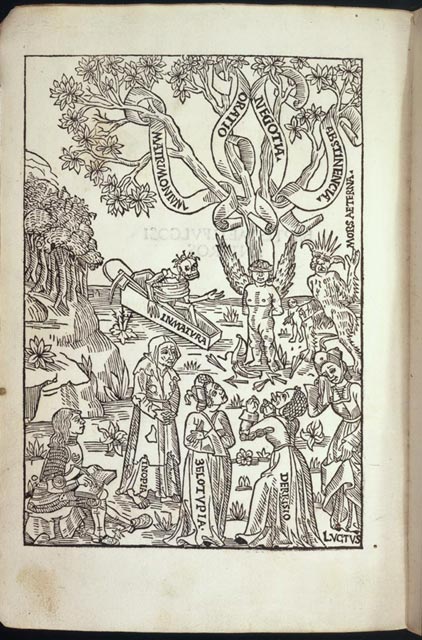
Savonarola's Art of Dying Well
Florence, after June 1497
This rare illustrated edition on the art of dying was written by the Florentine priest and reformer Girolamo Savonarola, whose rhetoric and political philosophy challenged de Medici Florence in the 1490s. The central image of "The Triumph of Death" is cut in simple contours without embellishment but with great imagination and flair. Screaming across the sky, death leaves nothing in its wake, not peasant, patrician, pope, or nun. The woodcut is framed by a four-part Florentine style border first used by Bartolommeo di Libri in his 1495 edition. The thick, elaborate, black-ground border decorated with classical motifs is a powerful contrast to the simple outline design of the central image. This second edition printed by Libri is one of five known copies in America, two of which are in the Library of Congress.
![Girolamo Savonarola. <em>Predica dell'arte del bene morire.</em> [Florence: Bartolommeo di Libri, after June 1497]. Rosenwald Collection. Rare Book and Special Collections Division, Library of Congress (24)](images/rwxs197s.jpg)
Girolamo Savonarola. Predica dell'arte del bene morire. [Florence: Bartolommeo di Libri, after June 1497]. Rosenwald Collection. Rare Book and Special Collections Division, Library of Congress (24)
Bookmark this item: //www.loc.gov/exhibits/heavenlycraft/heavenly-15th.html#obj23
Stephan Plannck's Second Edition of the Meditations
Rome, 1498
Like Stephan Plannck's 1484 edition (no. 9), this 1498 printing of Cardinal Juan de Torquemada's meditations on the life of Christ is illustrated with thirty-three woodcuts. However, each of them was newly designed and cut for the smaller format of this book. The composition of this image of "The Annunciation" compresses the design that appeared in the previous editions. The interior setting is more detailed in this new cut, with the addition of double arches and windows and a curtain in the background. The sloping floor provides a sense of perspective, an element missing in the original cut made more than thirty years earlier. In addition to the architectural features, the image is enhanced by the ornamental designs on the front of the kneeler on which Mary rests, the delineation of the Angel Gabriel's wings, the quality of Mary's hair, the folds of the garments, and the finely cut facial features of both figures. The judicious use of varied parallel lines to create shading and texture gives the woodcut a dimensionality rarely found in other illustrated books from Plannck's press.

Juan de Torquemada. Meditationes deu Contemplationes devotissimae. Rome: Stephan Plannck, August 21 1498. Rosenwald Collection. Rare Book and Special Collections Division, Library of Congress (25)
Bookmark this item: //www.loc.gov/exhibits/heavenlycraft/heavenly-15th.html#obj24
Biblical Story of Joseph
Florence, 1500
This volume contains four "rappresentazioni," printed tracts and plays celebrating lives of saints and telling biblical stories. These eight- to twelve-leaf pamphlets were a favorite of the Florentine public during the last years of the fifteenth century, and, as competition among publishers increased, woodcuts were added to bolster sales. This woodcut is the most interesting of the images that illustrates The Story of Joseph, Son of Jacob, printed by Bartolommeo di Libri around 1500. The woodcut illustrates the tale of "Joseph and Potiphar's Wife." The image freezes the moment as Joseph turns from the advances of Potiphar's wife, who is clasping his cloak and pulling the young man toward her. The woodcut design is perfectly balanced and conveys the desperation of the scene with both force and sensitivity. The shading near the woman's face, the use of parallel lines to accentuate the movement of the characters, and the varied border styles used to frame the image create a simple but compelling rendering of the story, well suited to the subject of the text.
![<em>La rappresentatione divota di Joseph figluolo di Jacob</em>. [Florence: Bartolommeo di Libri, ca. 1500]. Rosenwald Collection. Rare Book and Special Collections Division, Library of Congress (26)](images/rw345s.jpg)
La rappresentatione divota di Joseph figluolo di Jacob. [Florence: Bartolommeo di Libri, ca. 1500]. Rosenwald Collection. Rare Book and Special Collections Division, Library of Congress (26)
Bookmark this item: //www.loc.gov/exhibits/heavenlycraft/heavenly-15th.html#obj25
Basel
The first illustrated book containing woodcuts to appear in Basel was printed by Bernhard Richel in 1476. In that year he published an edition of Spiegel menschlicher Behältnis decorated with large woodcut initial letters and 273 woodcuts. Richel's woodcuts show influences of both Gunther Zainer's Augsburg edition of the Speculum humane salvationis printed in 1473 and the Netherlandish block book, Biblia pauperum, of the 1470s. After Richel's death in 1482, Nicolaus Kesler took over the business. Kesler is best remembered today for printing an edition of the Epistoles of Saint Jerome, which contains the famous woodcut by Albrecht Dürer of St. Jerome removing the thorn from the foot of a lion. Dürer spent nearly two years in Basel, between 1492 and 1494, and he is reputed to have made some woodcut designs for Michael Furters's Der Ritter vom Turm, 1493, and Sebastian Brandt's Das Narrenschiff, printed by Johann Bergmann von Olpe in 1494.
Woodcut Attributed to a Young Albrecht Dürer
Basel, not before 1497
The woodcut of "The Christ Child and the Four Evangelists" that decorates this Basel edition of Guillermus Parisiensis's commentaries on the Epistles is executed in a robust manner, especially in its depiction of the Christ Child and the garments of St. John at the lower left. The body of the child is clearly rendered in round contours and by the delicate use of variable parallel lines. The face of Christ is believable, and the spare use of black lines at the neck and shoulders captures a reality completely lacking in the fifty-three illustrations in the remainder of the book. This woodcut has been attributed to artist Albrecht Dürer because the technique used to create it resembles his technique. The attribution is supported by the fact that Dürer made designs for the printer Nicolaus Kesler between 1492 and 1494, when Dürer lived and worked in Basel.

Guillermus Parisiensis. Postilla super Epistolas et Evangelia. Basel: Nicolaus Kesler, not before 1497. Page 2. Rosenwald Collection. Rare Book and Special Collections Division, Library of Congress (27)
Bookmark this item: //www.loc.gov/exhibits/heavenlycraft/heavenly-15th.html#obj26
Image of Adam and Eve
Basel, 1498
This well-illustrated edition of the Revelations attributed to Methodius was edited by Sebastian Brandt, author of the famous The Ship of Fools. Its printer, Michael Furter, was among Basel's first generation of printers and spent his entire twenty-nine-year career working there. His edition of the Revelations is illustrated with fifty-five original woodcuts. The images differ in quality, and it appears that at least two different hands cut the blocks. This woodcut of "Adam and Eve in the Garden" is cut in a free, almost sensuous, style, in which a combination of round and angular contours outlines the figures. The rendering of the physical form of Adam and Eve is further enhanced by the use of varied parallel lines to model their figures, a Renaissance technique that accentuates the form of the human body. Great attention is also paid to Adam and Eve's hair, especially to Eve's flowing mane, a design cut in fine detail, which attests to the block cutter's skill. However, the renderings of the Tree of Knowledge and the limited detail of the landscape are less successful and exhibit characteristics of medieval style.
![[Methodius?]. <em>Revelationes divinae a sanctis angelis factae.</em> Basel: Michael Furter, 1498. Page 1. Rosenwald Collection. Rare Book and Special Collections Division, Library of Congress (28)](images/rw371_1s.jpg)
[Methodius?]. Revelationes divinae a sanctis angelis factae. Basel: Michael Furter, 1498. Page 2. Rosenwald Collection. Rare Book and Special Collections Division, Library of Congress (28)
Bookmark this item: //www.loc.gov/exhibits/heavenlycraft/heavenly-15th.html#obj27
Paris
The source of many French woodcuts during the period of early printing was the illuminated manuscript. The highly developed French style of illumination was distinctive in its use of contemporary French costume and unique border decoration. The style was also notable for particular facial characteristics used to distinguished the numerous saints, heroes, and historical figures represented in many woodcut images. Some of the earliest French printers were trained as illuminators, including Pierre Le Rouge and Antoine Vérard, whose printed books are illustrated with border designs and elaborate woodcuts in outline, taken freely from the manuscript tradition.
Remarkable Illustration of the Beginning of the End
Paris, 1493-94
This woodcut of the "Signs of Judgment Day" is the first in series of fifteen cuts illustrating the final coming of Christ that were designed for Antoine Vérard. The woodcuts are part of a much larger series devoted to the way of life for Christians and designed in the French style. This image demonstrates more artistic imagination than the others that illustrate this book. It depicts the sea rising to the mountain tops moments before it inundates the land and consumes the earth. The powerful form of the rising sea, cut in thick contours, is enhanced by the shading and the placement of the fish throughout the rising column of water. The figures of fish, an early Christian emblem for baptism or cleansing, was a readily recognizable motif to late medieval viewers. The rough mountain landscape capped with two standing trees complements the vertical thrust of the image and successfully balances the composition. The sparseness of the background with its open sky also contributes to the this stark presentation of the end of the world.
![<em>L'Art de bien vivre et de bien mourir.</em> Paris: Antoine Vérard for André Bocard, February 12, 1453. [i.e., 1493-94]. Page 1. Rosenwald Collection. Rare Book and Special Collections Division, Library of Congress (29)](images/rw0029s_p1s.jpg)
L'Art de bien vivre et de bien mourir. Paris: Antoine Vérard for André Bocard, February 12, 1453. [i.e., 1493-94]. Page 2. Rosenwald Collection. Rare Book and Special Collections Division, Library of Congress (29)
Bookmark this item: //www.loc.gov/exhibits/heavenlycraft/heavenly-15th.html#obj28
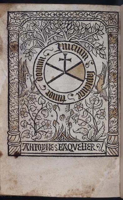
A Complex Composition in a Small Format
Paris, 1495-96
This commentary on the Ten Commandments, originally attributed to Nicolaus de Lyra, is known in only eight copies, this being the sole copy in America. This woodcut of "The Crucifixion" is cut in outline with shading produced by parallel lines that give form to the figures represented in the image. It is highlighted in part with a yellow wash and a drop of blue applied to Christ's halo, accentuating His divinity. The woodcut is framed by an architectural border designed as part of the block. Like the application of watercolor, borders are commonly used in French woodcuts of the period to embellish an image and focus attention on it. The clever use of a zig-zag pattern in the border also directs the viewer's eye to the action of the central figures in the scene. The woodcut is greatly enhanced by the design of the figure of the soldier in the right foreground. His costume, physical features, and facial expression are all typical of the French style and suggest that a well-trained hand was responsible for the woodcut.
![[Henricus de Vrimaria]. <em>Praeceptorium divinae legis.</em> Paris: Pierre le Dru for Antoine Baquelier, August 11, 1495. Page 1. Rosenwald Collection. Rare Book and Special Collections Division, Library of Congress (30)](images/rw429_1s.jpg)
[Henricus de Vrimaria]. Praeceptorium divinae legis. Paris: Pierre le Dru for Antoine Baquelier, August 11, 1495. Page 2. Rosenwald Collection. Rare Book and Special Collections Division, Library of Congress (30)
Bookmark this item: //www.loc.gov/exhibits/heavenlycraft/heavenly-15th.html#obj29
By the Famous Printer Guy Marchant
Paris, 1495-96
This first edition of this mathematical text by Archbishop of Canterbury Thomas Bradwardine was printed by the famous French printer, Guy Marchant. It is illustrated with six woodcuts, three of which are displayed. "The Virgin and St. Anne," "François Villon," and "The Advocate" reflect a number of the elements that are characteristic of the French style. The highly developed landscape in "The Virgin and St. Anne" creates a sense of space and perspective, a practice typical of the manuscript tradition and translated to the format of the late medieval woodcut. The images of "François Villon" and "The Advocate" are also cut in outline with an emphasis on the natural pose of the figures, their contemporary costume, and distinctive facial characteristics. Guy Marchant was famous for creating images of all social classes, including chambermaids and matrons, merchants and farmers, priests and lawyers. All of them were rendered with a realism that was recognized by the public and fueled a demand for this style of woodcut image.

Thomas Bradwardine. Arithmetica speculativa. Paris: Guy Marchant, February 1495-96. Rosenwald Collection. Rare Book and Special Collections Division, Library of Congress (31)
Bookmark this item: //www.loc.gov/exhibits/heavenlycraft/heavenly-15th.html#obj30
Netherlandish Woodcut Design
Deventer, between 1490 and 1492
Seventy-three editions of Cordiale quattuor novissimorum were published in Europe between 1470 and 1501. This popular text contains Christian commentary on the four final stages of human experience: death, judgment, heaven, and hell. This a title-page woodcut of the "Mass of St. Gregory" is a complex image showing the saint kneeling before an altar and witnessing the miraculous appearance of Christ To his left is a bishop holding Gregory's mitre and staff of office, and to his right is his deacon, who is helping in the celebration of the mass. The transubstantiation of bread and wine into the body and blood of Christ is graphically represented by the blood flowing from Christ's pierced breast into the chalice below. The image is executed in the northern style common to Netherlandish woodcut design. The block is cut in outline with thick contours and parallel lines for shading. The composition is all on one plane, with little ornamentation or embellishment. First advocated by Saint Gregory, the doctrine of transubstantiation is fundamental to the Roman Catholic mass.
![<em>Cordiale quattuor novissimorum.</em> Deventer: Jacobus de Breda, [between August 9, 1490 and October 31, 1492]. Rosenwald Collection. Rare Book and Special Collections Division, Library of Congress (32)](images/rw501s.jpg)
Cordiale quattuor novissimorum. Deventer: Jacobus de Breda, [between August 9, 1490 and October 31, 1492]. Rosenwald Collection. Rare Book and Special Collections Division, Library of Congress (32)
Bookmark this item: //www.loc.gov/exhibits/heavenlycraft/heavenly-15th.html#obj31
Color Image of Episode from Passion
Antwerp, 1488
Gerard Leeu's illustrated edition of the Meditations contains seventy-five woodcut images, all colored by a contemporary hand. This edition appears to be the source for the Brandis edition (no. 8) because that book's size, binding, and many of the illustrations are similar. This woodcut of the "Guards Gambling for the Garments of Christ" is quite different from the uncolored version in the Brandis edition. Although the characters are not as well designed or as threatening as those that appear in the Brandis one, the use of color and contrast is a very effective device in conveying the ominous quality of this Passion story. The black background and the bright colors of the figures create a striking portrait of the guards fighting one another for the garments. The small size of these images tested the skills of the designer and woodcutter. The thick contours of the outlines, the limited use of decoration and shading, and the use of color are consistent with Netherlandish style of the period. This copy is the only one in an American library.

Jordan van Quedlinburg. Meditationes de Vita et Passione Jesu Christi. Antwerp: Gerard Leeu, November 20, 1488. Rosenwald Collection. Rare Book and Special Collections Division, Library of Congress (33)
Bookmark this item: //www.loc.gov/exhibits/heavenlycraft/heavenly-15th.html#obj32
Flemish Design First Used by William Caxton
Westminster [London], after July 1499
This copy of the "The Most Excellent Treatise of the Three Kings of Coleyne" appears to be the only known complete copy. It was printed by Wynkyn de Worde, William Caxton's assistant and successor. The woodcut of "Christ on Calvary" appears Flemish in style, an attribution consistent with the beginnings of Caxton's printing career in Bruges in the 1470s. Many Flemish influences appear in the image, the most powerful being the rendering of the human form in motion. The way in which Christ's body falls to the right as it receives the thrust of the spear, and the postures of the thieves, one with his dangling arms and legs and the other arched over his cross, reflect a plasticity of the human form common in Flemish designs. Also, the exposure of the hind portion of the horses out to the edge of the image is a very strong compositional element that draws viewers into the scene, making the them participants in the events of the Crucifixion and not simply bystanders.
![[Joannes of Hildesheim]. <em>Liber de gestis et translatione trium regum.</em> Westminster [London]: Wynkyn de Worde, [after July 1499]. Rosenwald Collection. Rare Book and Special Collections Division, Library of Congress (34)](images/rw577s.jpg)
[Joannes of Hildesheim]. Liber de gestis et translatione trium regum. Westminster [London]: Wynkyn de Worde, [after July 1499]. Rosenwald Collection. Rare Book and Special Collections Division, Library of Congress (34)
Bookmark this item: //www.loc.gov/exhibits/heavenlycraft/heavenly-15th.html#obj33
Seville and Pamploma
German and Italian influences on the development of Spanish printing and illustration are important considerations when examining Spanish books. Many of the first printers in Spain were born and trained North of the Alps and their woodcut reflected these traditions. Thick outline, looped and angular cuts which define the garments, and consistent shading patterns are all techniques used by German block cutters. Compositional elements and ornamental schemes reflect styles brought by the Italian printers and designers who moved South from Naples in the 1490's. Spanish style also evolved from the influences gleaned from Arabic decorative design patterns and letter forms that are distinctly non-European in form.
Spanish Design with Arabic and Venetian Influences
Seville, 1499
This book appears to be the second Seville edition of Rodrigo Fernández de Santaella's 1498 instructions for the service of the mass. It is illustrated with this woodcut of the "Mass of St. Gregory" enclosed in a four-part woodcut border. The image has compositional similarities to the one appearing in the Cordiale quatour novissimorum (no. 32). It contains many of the instruments of Christ's passion and illustrates the transubstantiation of bread and wine into the body and blood of Christ. A distinguishing feature of this woodcut is the design of vines and flowers that appears on the face and side of the altar, suggesting Arabic ornamentation. Also, the black-on-white design of the floor gives the image an Italian feel. Borders of dissimilar design were often combined to frame Spanish woodcuts during the late medieval period. The practice reflects an individuality of style, the limited access that printers had to skilled cutters, and the lack of woodblocks available during the first two decades of book illustration in Spain.

Rodrigo Fernández de Santaella. Sacerdotalis instructio circa missam. Seville: Johann Pegnitzer, Magnus Herbst, and Thomas Glockner, for Johannes Laurenti, June 14, 1499. Rosenwald Collection. Rare Book and Special Collections Division, Library of Congress (35)
Bookmark this item: //www.loc.gov/exhibits/heavenlycraft/heavenly-15th.html#obj34
Spanish Book on Holy Trinity
Pamplona, ca. 1499
This book is the second Spanish printing of Petrus de Castrovol's commentaries on the nature of the Trinity and the divinity of Christ. This illustration of the Holy Trinity is the book's only woodcut. It depicts the crucified Christ in the arms of the God the Father, with the Holy Spirit represented as a dove, perched on the Father's right shoulder. The angel to the right is pulling back a curtain, a gesture that suggests the revelation of the mystery of the Trinity. The woodblock was cut in outline with a minimal use of shading to delineate the body of Christ and the gown of the Father. This clear and clean cut, straightforwardly designed and without embellishment, depicts the central theme of Castrovol's text. The woodcut is enclosed by four different floral borders, cut in black ground. Such decorative borders are important elements of Spanish book illustration at the end of the fifteenth century. Their various styles document the influence of Italian, Arabic, and German styles on their design.
![Petrus de Castrovol. <em>Tractatus super symbolum Athanasii: Quicumque vult</em>. Pamplona: [Arnoldo Guillen de Brocar, ca. 1499]. Rosenwald Collection. Rare Book and Special Collections Division, Library of Congress (36)](images/rw587s.jpg)
Petrus de Castrovol. Tractatus super symbolum Athanasii: Quicumque vult. Pamplona: [Arnoldo Guillen de Brocar, ca. 1499]. Rosenwald Collection. Rare Book and Special Collections Division, Library of Congress (36)
Bookmark this item: //www.loc.gov/exhibits/heavenlycraft/heavenly-15th.html#obj35
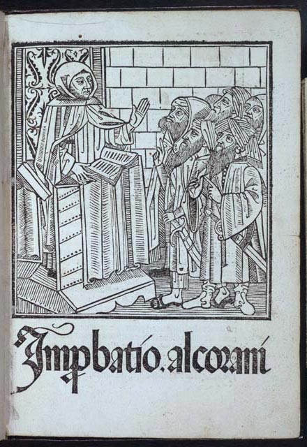
By Printer Trained in Naples
Seville, 1500
Ricoldo da Montecroce was fluent in both Arabic and the tenets of the Koran, and his Improbatio Alcorani became an influential source of information on the laws of the Koran and Islam for Western theologians. His book is illustrated with this one woodcut, an initial letter, and a printer's mark. The image is well balanced, and the figures and the interior setting are well defined. The composition is reminiscent of the Florentine woodcut of the "Master and his Seven Students" (no. 12). The thick outlines, the looped and angular cuts which define the garments, and the consistent shading patterns are all techniques used by German block cutters. However, the ornamentation of the image is distinctively Spanish. The Arabic designs on the door, the distinctive style of the costumes, and the use of a Spanish type below the image are all elements of Spanish woodcut style at the end of the fifteenth century.
Ricoldo da Montecroce. Improbatio Alcorani. Seville: Stanislaus Polonus, 1500. Rosenwald Collection. Rare Book and Special Collections Division, Library of Congress (37)
Bookmark this item: //www.loc.gov/exhibits/heavenlycraft/heavenly-15th.html#obj36